

The Digital Jungle: Why Buttons “Caress” Us and Errors “Bite”
 Tornike Moss
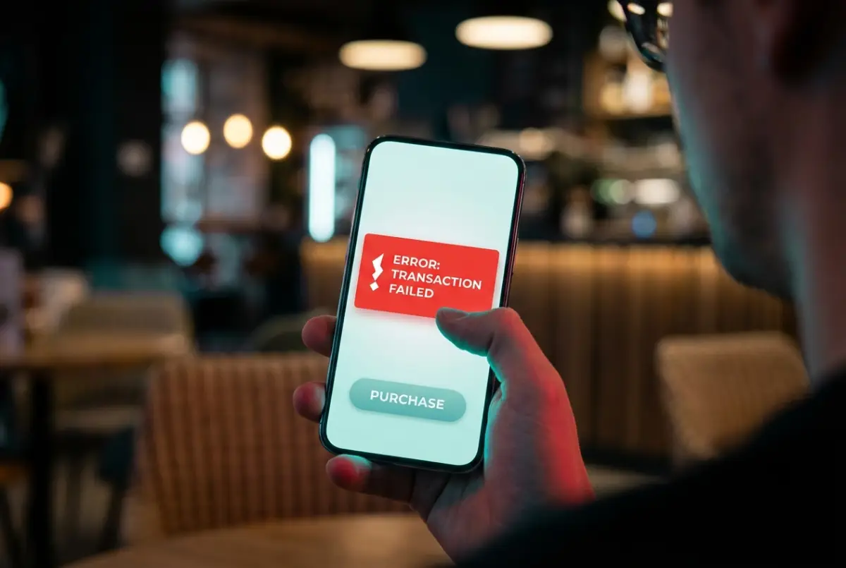
Pick up your smartphone, unlock it, and simply look at the screen. What do you see? Chances are, you won’t find a single truly aggressive corner. App icons are rounded, notification bubbles are oval, search bars resemble soft pills. Even the phone itself is sculpted to slide smoothly in your hand, without digging into your fingers. Now think back to the last time your phone or computer showed an error message. What did it look like? Almost always, it appeared inside a sharp, angular frame—often with an exclamation mark trapped in a triangle.
This contrast is not a matter of aesthetic taste or a design trend started by Apple or Google. It’s based on something your brain learned millions of years ago: shape can either protect you—or hurt you.
Despite holding cutting-edge technology in our hands, our brains are still wired for the savannah. Evolutionary psychology explains this with brutal simplicity. In nature, sharp shapes mean danger. Predator teeth, thorns, jagged rocks, broken bones—edges cut, stab, and injure. When the eye detects a sharp angle, especially a downward-pointing triangle, the amygdala—your brain’s internal alarm system—tightens instantly and sends a warning: Be careful.
Round shapes do the opposite. They signal safety. Ripe fruit, the sun, stones polished by water, and most importantly, the human face—especially a baby’s face—are all round. A circular form suggests that touching it won’t hurt you. It won’t bite.
That’s why a rounded button on your screen feels friendly. On a subconscious level, your brain interprets it as safe to touch. In UX design, this connects directly to cognitive load. Studies show that the human eye processes rounded shapes more easily and with less effort. When your gaze encounters a corner, it has to stop and sharply change direction. With circles and ovals, the eye glides smoothly, like a car on a highway. Designers want you to move through an app without friction, without stumbling—so “Buy,” “Send,” and “Continue” buttons are almost always rounded. This reduces stress, increases trust, and, most importantly, speeds up decision-making. You don’t think—you tap.
But there are moments when an interface must do the opposite. Sometimes, it needs to shock you awake.
Imagine transferring money to the wrong bank account, or permanently deleting an important file. In these situations, a soft, friendly design would be dangerous. The system has to say Stop. This is where sharp geometry comes in. Error messages are intentionally angular and harsh. Rectangles with rigid edges create visual discomfort, forcing your brain to pause and refocus. If warnings were round and gentle, your mind might ignore them and continue on autopilot. The danger wouldn’t register.
So our digital comfort is built on a clever manipulation of ancient instincts. Designers place cushions where they want to calm us—and bare their teeth when they need our full attention. Rounded shapes lull us forward; sharp ones snap us back to awareness.
Now pause for a moment. After reading this, which button will your finger reach for first—the rounded one or the angular one? And more importantly: did you make that choice, or did the shape make it for you?
Go backComments (0)
From This Author
Select Crypto to Support the Author 💫
×TXintEE7aezp6QxNNtbghCXvmXJdgofEyr
0x9c6299454A6B617A0Db228024279F2a3EEf956dD
bc1qj7caz3xfh5qd4ud3v3nh7k4tfl5lg8jh9er73e
0x9c6299454A6B617A0Db228024279F2a3EEf956dD
3TndfWAhPytTaBZjC2GbNWqh9iWx171SYACjbG2j5vx8
DHsrtwiL56Xk1xAj3fe8pVcfLhE8xgt3EQ
0x9c6299454A6B617A0Db228024279F2a3EEf956dD
UQDFkubJxb8KmxFmy1arJxkewzmNEg6-G2pJFVzFihB65d7W
ltc1q3fentl6ur9cxm0vxyqkdmmzxkj92j00p9l8m7z
✍ Article Author
- Registration: 26 July 2025, 19:34
- Location: Georgia