


Designing Free Will: How We Choose the Path Someone Else Paved
 Tornike Moss
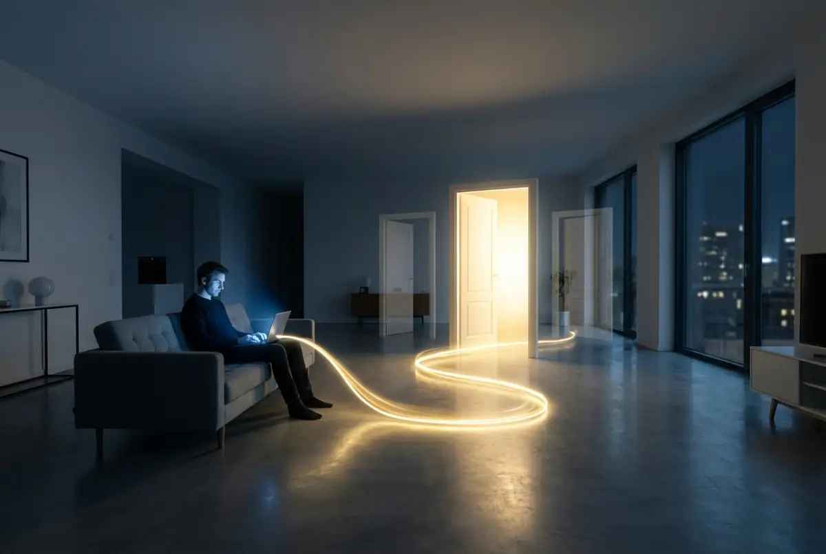
Imagine a typical evening. The glow of a laptop or smartphone screen fills the room. You’re buying something or signing up for a new service. On the screen, three options appear: Basic, Standard, and Premium. You scan the features, compare prices, consider your budget, and finally—after what feels like careful analysis—you click the middle option. You’re satisfied. You believe you’ve made a rational choice, a sensible compromise.
In reality, that decision wasn’t yours. It was made the moment a designer laid out the interface. You simply accepted the suggestion.
We like to believe that the digital world is a space of freedom. The internet, after all, feels like an endless ocean of possibilities. But if you look closely, you’ll notice that this “ocean” behaves more like a carefully engineered water park, where currents carry you exactly where the system was designed to send you. Interfaces are not neutral environments. They are architectures of choice, where every color, spacing, and alignment speaks directly to the subconscious.
We often call this user experience design—UX—but psychologically, it functions more like a well-meaning guide who doesn’t want you to get lost. The human brain is evolutionarily economical. It dislikes complex decision-making because thinking costs energy. When we’re faced with too many equally weighted options, anxiety kicks in. This is known as the paradox of choice. Designers understand this well, which is why they rarely offer true freedom. Instead, they offer the illusion of choice, carefully laying down a path so your brain doesn’t have to work too hard.
Look at the visual hierarchy. The preferred option is always larger, brighter, more saturated. It pulls your attention like a magnet. Nearby alternatives—Cancel, Later, or Skip—are often reduced to faint text, small fonts, or low-contrast colors, as if apologizing for existing at all. This isn’t accidental. It’s the power of the default option. When a system preselects a checkbox or labels a plan as “Recommended,” it’s quietly saying: Don’t overthink it. Most people choose this. You should too. And we comply, because we are social beings, deeply influenced by perceived consensus—even when that consensus is manufactured.
The mechanism works so well because it flatters our ego. We feel smart for choosing the “best deal,” when in fact we simply walked toward the brightest door in a dark corridor. Interfaces are filled with micro-cues: green tones that signal safety, progress bars that pressure us to finish what we started, generous white space that funnels our gaze toward a single primary action. Every detail nudges us forward without ever demanding explicit consent.
At its core, this isn’t evil manipulation. It’s an attempt to create comfort. Absolute freedom in the digital space would be overwhelming—pure chaos. We need rails to move along, because rails provide reassurance. Still, there’s a revealing moment when you become aware of this system—when you realize that what you call “free will” on a screen may be nothing more than a well-written script.
So the next time you press Confirm, pause for just a second and ask yourself:
Did I make this decision—or did I simply follow the most beautiful button?
Comments (0)
From This Author
Select Crypto to Support the Author 💫
×TXintEE7aezp6QxNNtbghCXvmXJdgofEyr
0x9c6299454A6B617A0Db228024279F2a3EEf956dD
bc1qj7caz3xfh5qd4ud3v3nh7k4tfl5lg8jh9er73e
0x9c6299454A6B617A0Db228024279F2a3EEf956dD
3TndfWAhPytTaBZjC2GbNWqh9iWx171SYACjbG2j5vx8
DHsrtwiL56Xk1xAj3fe8pVcfLhE8xgt3EQ
0x9c6299454A6B617A0Db228024279F2a3EEf956dD
UQDFkubJxb8KmxFmy1arJxkewzmNEg6-G2pJFVzFihB65d7W
ltc1q3fentl6ur9cxm0vxyqkdmmzxkj92j00p9l8m7z
✍ Article Author
- Registration: 26 July 2025, 19:34
- Location: Georgia