

The Silence That Commands Us: Why the Brain Obeys the Button, Not the Words
 Tornike Moss
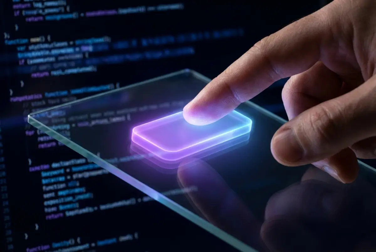
Your thumb approaches the surface of the screen. The movement is so automatic—so deeply embedded in muscle memory—that it requires no conscious thought. In a fraction of a second, your eyes scan a chaos of pixels, bypass hundreds of words, paragraphs, and headlines, and lock onto it: a bright, defined geometric shape. This isn’t reading. It’s hunting—or rather, magnetic attraction. The moment your finger touches the glass and the interface responds visually, a very different chemical process unfolds in the brain than when you read plain text. We don’t trust words; we trust form. And that trust is far older and more primitive than any algorithm of the modern digital world.
It’s revealing to observe how the human brain converts interface elements into a hierarchy of authority. Text, by its nature, demands interpretation. It requires decoding, semantic processing, contextual understanding. Even though this takes milliseconds, it is still a cognitively “expensive” operation. When we read, the prefrontal cortex engages—we think, analyze, doubt. Text is a proposal. A button, by contrast, is something else entirely. A button doesn’t invite debate; it proposes action. It promises completion, outcome, transformation. When a word is framed and filled with color, it stops being information and becomes a physical object in a two-dimensional space. And that’s when evolutionary mechanisms activate: the brain treats objects as opportunities for interaction, not as abstract symbols.
James Gibson’s theory of affordances plays a decisive role here—though in digital environments it works more subtly. In the physical world, the shape of a stone suggests it can be picked up. In the digital world, a button’s visual cues—contrast, rounded corners, even a microscopic shadow—create the illusion of physicality. The button seems to have weight, presence, and, most importantly, consequences. Text lies on the screen; a button appears to rise from it. This illusion of depth—retained instinctively from skeuomorphism through flat design—is why buttons are perceived as authoritative. They resemble a door handle in an unfamiliar room: the one solid thing you can grasp.
But why do we trust them? The trust comes not from aesthetics, but from reduced anxiety. Uncertainty is the brain’s greatest stressor. Plain text—such as a simple hyperlink—leaves space open. It is weak, ambiguous, possibly irrelevant. A button, with its clear boundaries, creates a sense of safety. The frame around the text psychologically contains chaos. It says, “Everything that matters is here. The rest of the world can wait.” It is visual silence within noise. When an interface offers two choices—one as a bold button, the other as faint text—it isn’t offering a real choice. It exploits a biological impulse: conserving energy. The bold button is the familiar path; the text is the dark forest. The brain automatically selects the option that burns fewer calories in decision-making.
Color is the emotional language of this command. We often think we choose colors for aesthetics, but interface designers use color to speak directly to the limbic system. A blue or green button isn’t merely “nice”—it signals permission, an open path. Red signals danger, but also urgency, releasing a small dose of adrenaline. Text has no such power. Black text on a white background is neutral information. Place that same text inside a purple rectangle, and it becomes an imperative. This transformation doesn’t occur in the eye, but in the brain region responsible for reward anticipation. The dopamine loop closes not when the result arrives, but when the button appears. The button itself is the promise—and we prefer buying the promise over analyzing dry information.
Look deeper, and the button becomes an act of delegating responsibility. When we read, we are active participants; we construct meaning. When we press a button, we become passive recipients—we grant the system permission to act on our behalf. “Buy,” “Send,” “Confirm”—these verbs aren’t there to describe an action, but to reassure us: Just press; I’ll handle the rest. This is technological paternalism. The button is an authority figure, a parent holding our hand to cross the street. Text is merely a passerby—able to explain, but not to guide.
This is why the darkest manipulations in interface design hide inside button design. When “Cancel” is barely visible in gray, while “Continue” pulses and glows, the system exploits an evolutionary fear: losing visual orientation. We fear what is unclear, what lacks defined boundaries. The button offers an illusion of control. We believe we are in charge because we press—but in reality, the placement, size, and contrast of the button have already determined our movement before we’re aware of it. Our finger obeys design the way iron obeys a magnet.
In the end, the authority of the button is built on silence. Text speaks—it explains, argues, negotiates. The button says nothing. It waits. It stands like a monolith in the digital field—solid, unchanging. And we, exhausted by uncertainty and information noise, always move toward what asks the fewest questions and looks most like an exit. We press, the screen changes, and we feel the relief of completion.
But have you ever wondered—at the exact moment your finger touches the screen—did you make a decision, or did you simply execute a command hidden inside a beautifully designed rectangle?
Go backComments (0)
From This Author
Select Crypto to Support the Author 💫
×TXintEE7aezp6QxNNtbghCXvmXJdgofEyr
0x9c6299454A6B617A0Db228024279F2a3EEf956dD
bc1qj7caz3xfh5qd4ud3v3nh7k4tfl5lg8jh9er73e
0x9c6299454A6B617A0Db228024279F2a3EEf956dD
3TndfWAhPytTaBZjC2GbNWqh9iWx171SYACjbG2j5vx8
DHsrtwiL56Xk1xAj3fe8pVcfLhE8xgt3EQ
0x9c6299454A6B617A0Db228024279F2a3EEf956dD
UQDFkubJxb8KmxFmy1arJxkewzmNEg6-G2pJFVzFihB65d7W
ltc1q3fentl6ur9cxm0vxyqkdmmzxkj92j00p9l8m7z
✍ Article Author
- Registration: 26 July 2025, 19:34
- Location: Georgia